PHONE: (732) 266-1287

Tips & Tricks of the Trade: Watercolor Techniques
I love when Close To My Heart shares some of the Art Department’s techniques of their creations. Thankfully, it’s all HERE for you to view too! Two great looks! Two simple tutorials! Complete with finished project look! I love that! Here’s a short list of materials shown so you have an idea of the product line used to create these fantastic looks with WATERCOLOR:
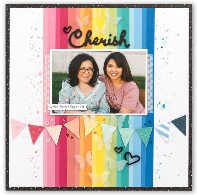
- Waterbrushes: Used the medium on the ‘speckled’ layout; used the flat large on the rainbow layout
- Watercolor Paints: used these paints which are so inexpensive to color the projects
- Watercolor Paper: recommended when you plan to use a lot of watercolor for a layout, or on cards
- Watercolor Pencils: (Not shown in video). These are lovely to work with to blend color with pencils as well as the waterbrushes above.
- Black Intense Ink: (Not shown in video) but recommended to use with stamping outline stamps and coloring in with watercolor paints.
Here’s the article from our Close To My Heart blog:

Exploring Watercolor Techniques
As you know, we love exploring new techniques here at Close To My Heart, but we also love expounding on old favorites. Recently, we’ve had a lot of fun playing around with various watercolor techniques, and we’re so excited to share a couple with you today! We asked a few of our artists to demonstrate some of their ideas in speedy video clips, so you can see them in action, too!

The first technique we’ll be looking at today is a splatter technique. This watercolor method allows you to add a little “controlled crazy” to your project. J
As you can see in the video, you’ll start by using a waterbrush to activate your watercolor paints by adding a drop or two of water. Once you’ve selected and activated all the colors you’d like to use, dip the waterbrush into your color of choice and swirl it around a bit, making sure to get a decent amount of paint onto the tip of your brush.
When you feel like the brush is sufficiently saturated, bring the brush over your page and lightly tap it against your index finger. This will send a series of splatters raining down onto the page to create a fun, haphazard feel.

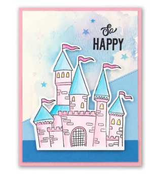
For our next technique, we’ll be showing you how to create and replicate a soft color transfer.
To recreate this look, paint directly onto your All-purpose Mat with your waterbrush. The paint will probably stay in small droplets and won’t want to spread across the mat, but that’s just fine. When you’ve added all the colors to your mat that you’d like to use in the paint puddle, gently lay your card or page down over the paint.
When you lift it up, you should have achieved a color transfer that is both soft and seamless. If you’d like it to be blended out a little more, you can swirl your card or base page around in the paint, creating the look you see here.

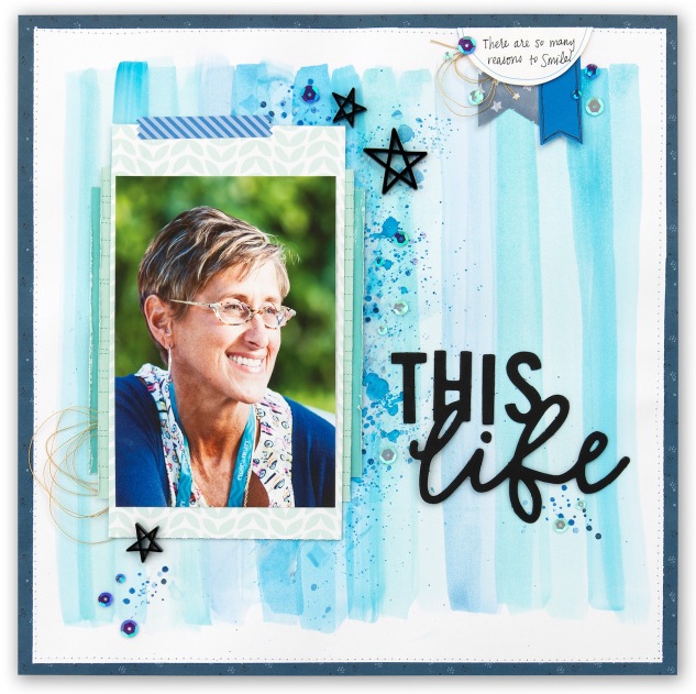
The last technique we’re showcasing today is a combination of two different techniques. (Technique combinations help you to really personalize each project, so don’t ever be afraid to experiment!)
Tip: For pages like this one, it’s not a bad idea to use actual watercolor paper. When you paint over a large surface area, the paper will start to absorb the water and can curl or ripple, which distorts your project. Using watercolor paper is more resilient and shouldn’t ripple or curl as your paint.
For this page, we started by selecting various shades of blue from our watercolor palette. Then, we painted long strokes down the page with a waterbrush. Once we made a couple strokes with our first color, we moved on to our next shade of blue, creating a sort of stripe sequence down the page. By sticking with a single-color theme, it’s easier to achieve a nice blend as you move across the page, and you can avoid unintentional color combination.
Tip: If you’re unsure of how a color will look on the page, it’s a good idea to do a test stroke on a piece of scrap paper. This is especially helpful if you’re mixing two colors together.
Continue alternating between your various colors or shades until you’ve covered the width of your page. Then, you’ll revisit the splatter technique we showed you earlier on in this post. Select one or two of your favorite colors and splatter it across your page. This is another place to be aware of color combination, so we recommend choosing colors that you already used in your stripe sequence. For this example, we stuck with the tried and true blue.
If you want to shake things up even more, gently blend out some of the larger splatters on your page. You can even paint a few new strokes if you want to. It’s really all up to you! We loved sharing a few of our favorite watercolor techniques with you today!
IF you found this post inspirational and would like to make a purchase on MY WEBSITE, click here.


