PHONE: (732) 266-1287
Changing Your Photos to Black & White or Sepia Tone for a Layout
Transforming your photos into black and white or sepia tones can completely change the mood and depth of your layout. When you take images from different seasons—spring blossoms, summer sunshine, autumn leaves, or winter snow—and convert them to a unified tone, you create a cohesive and timeless look.
Why it works:
- Consistency: Different lighting and color palettes from each season can clash. Converting them to monochrome or sepia unifies the overall design.
- Focus: Removing color draws attention to texture, shape, and emotion.
- Mood: Black and white adds drama and nostalgia, while sepia brings warmth and a vintage charm.
Tip: Try mixing both tones—use black and white for strong contrast and sepia for softer, sentimental moments. The result is a layout that feels balanced, artistic, and deeply expressive.
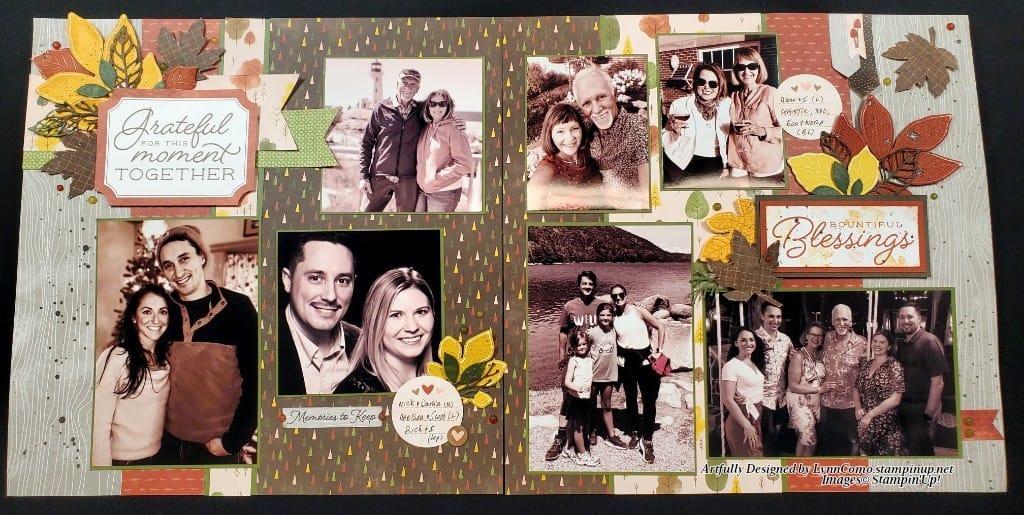
An Excellent Example of the Black & White or Sepia Layout Technique
This layout beautifully demonstrates how powerful tone adjustments can be. The photos span all four seasons—vacations, cozy moments at home, family gatherings, and intimate couple shots. Each image carries its own unique energy, yet when converted to black and white or sepia, they come together in perfect harmony.
The absence of color allows the viewer to focus on expressions, connections, and the story behind each moment. The contrast between the different scenes—sunny beaches, snowy days, autumn walks, and spring blooms—creates a rhythm that feels both nostalgic and timeless.
The result is a layout that doesn’t just display photos; it tells a cohesive story of family, love, and the passage of time through the seasons.
I do hope you give this technique a try!